
Visual Identity Expansion
Big Marble Go Centre in Medicine Hat, Alberta
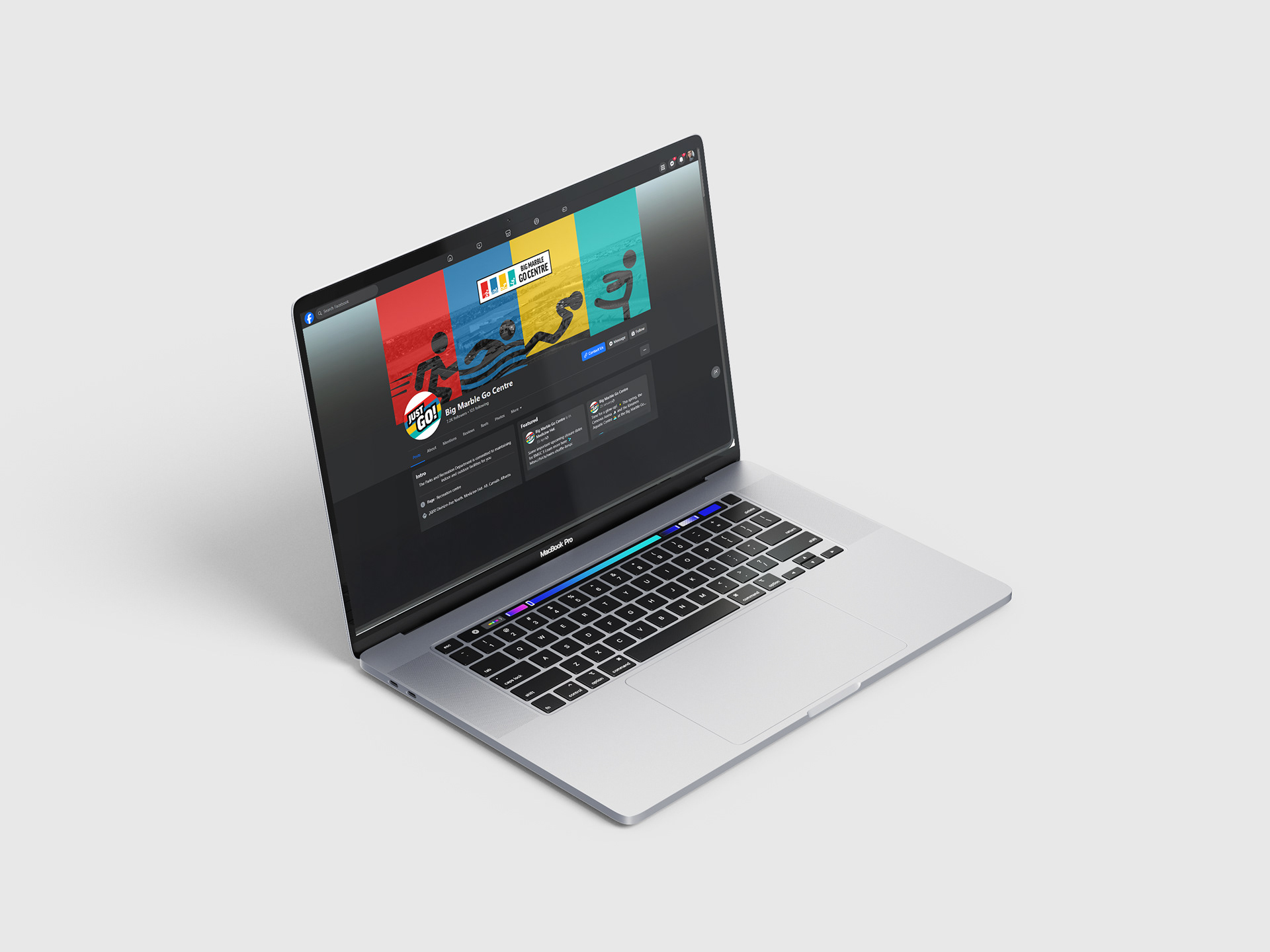
I had the exciting opportunity to expand the visual identity of the Big Marble Go Centre in Medicine Hat, Alberta. The goal was to build a scalable, cohesive identity that works seamlessly across digital platforms, physical spaces, and marketing materials—reinforcing the brand’s message and values. This updated system builds on the BMGC’s well-loved and recognized foundation, enhancing key elements like the logo, colours, and typography while incorporating dynamic imagery.
Logo Revision + Slogan
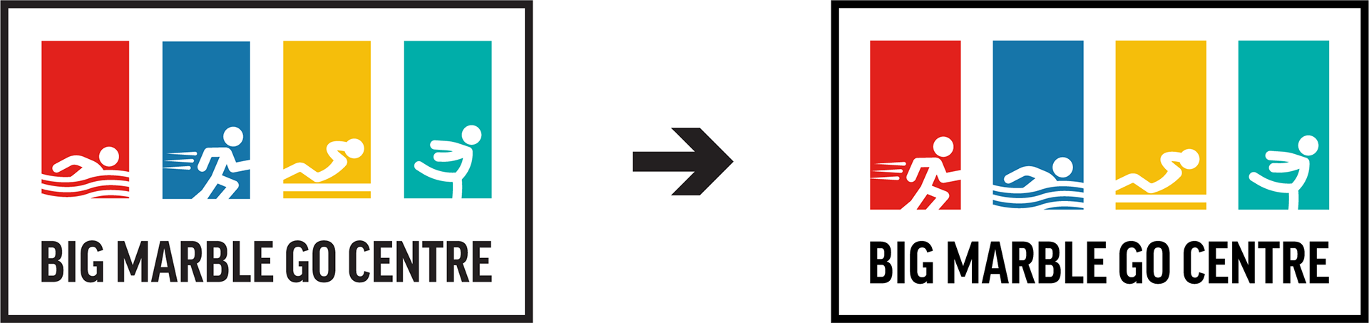
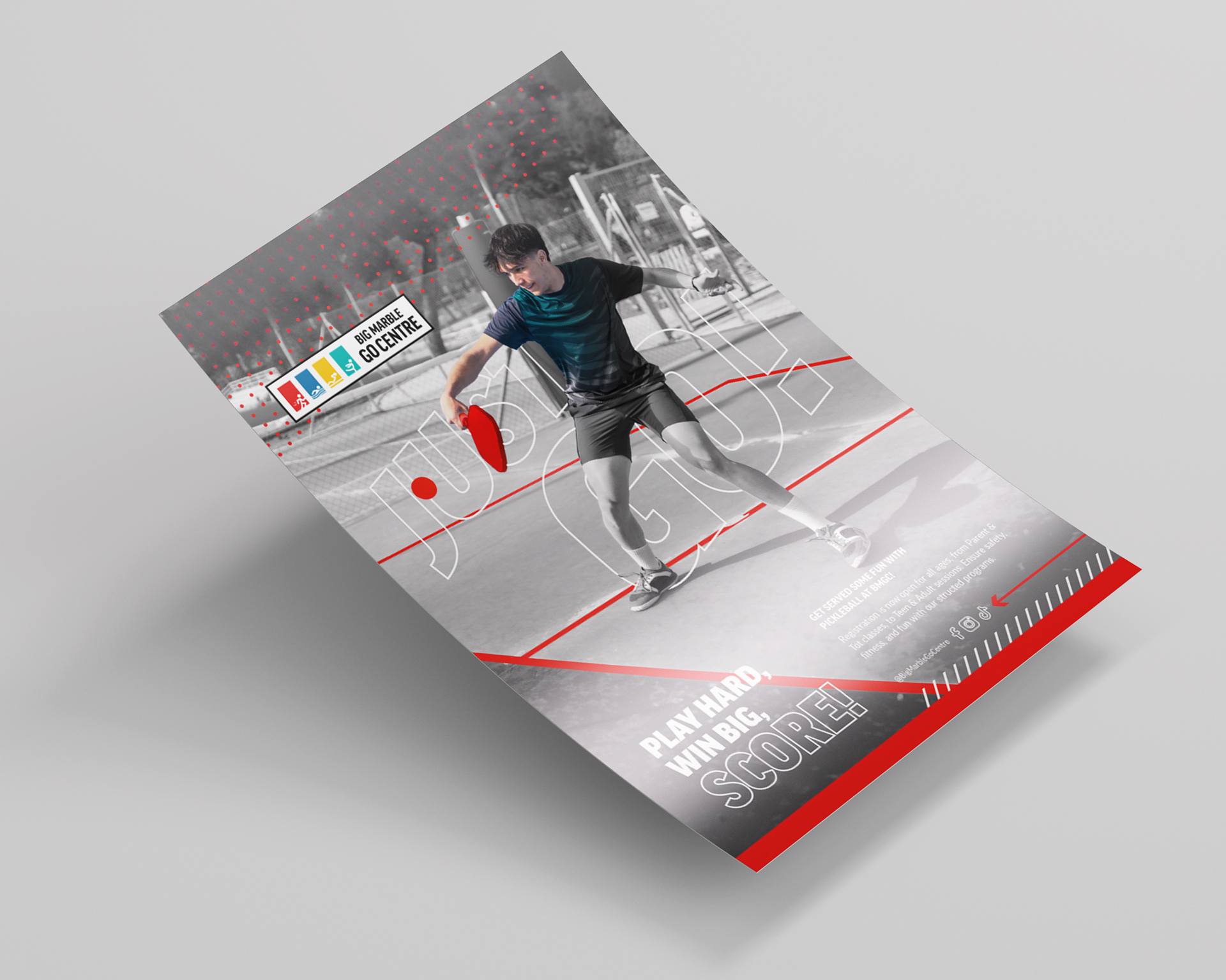
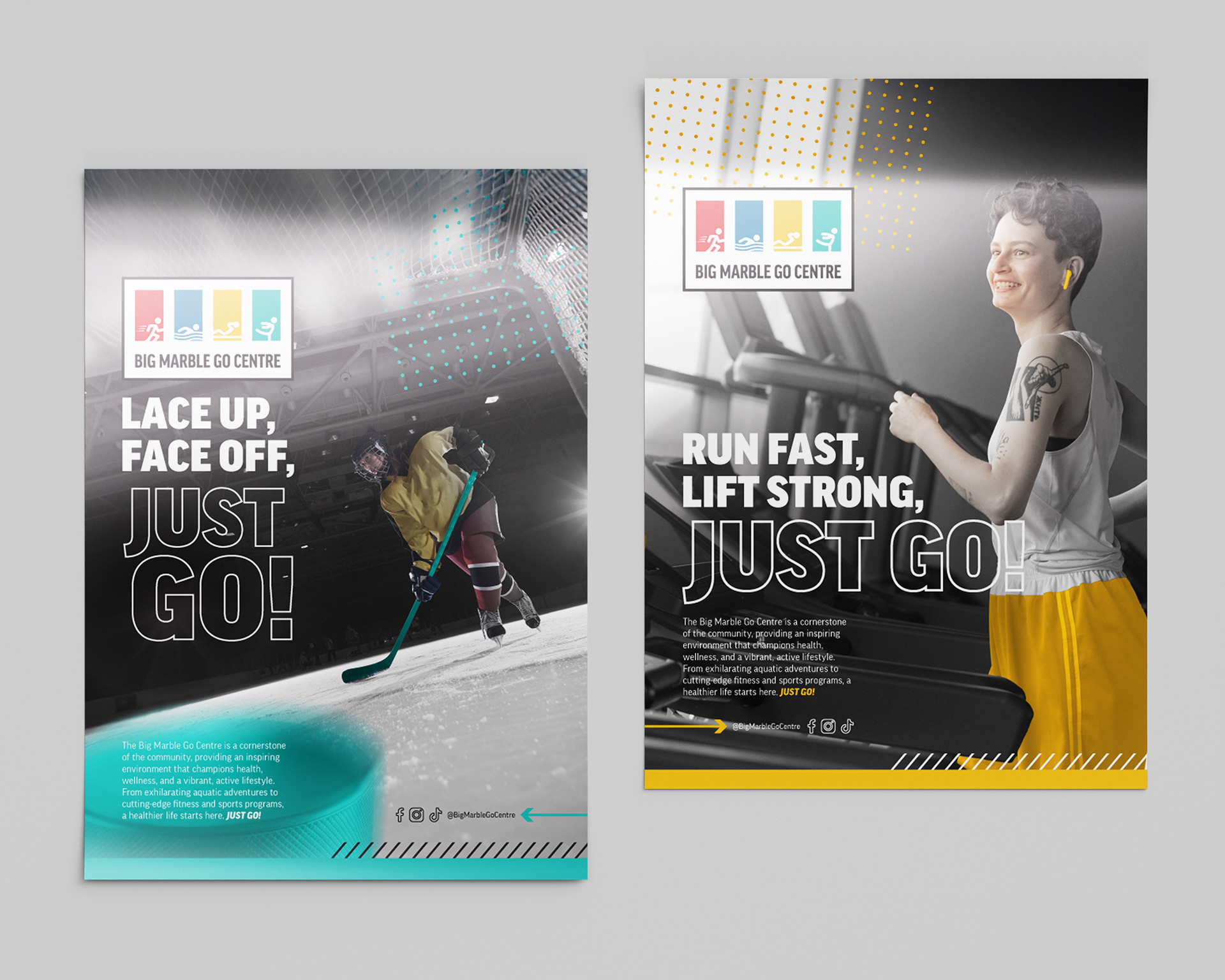
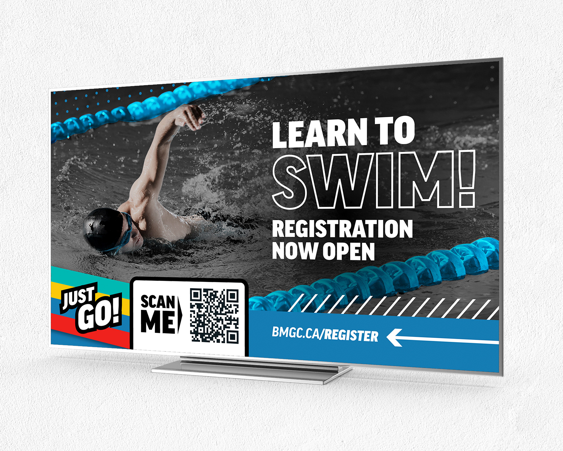
The Big Marble Go Centre has a logo that's easily recognized and loved within its community. We made a small tweak to fine-tune the colour associations. The swimming icon is now placed on the blue panel, while the running icon sits on the red panel, making everything feel more aligned and cohesive.


Just Go! Has been adopted as a slogan for the facility.
Motif Elements
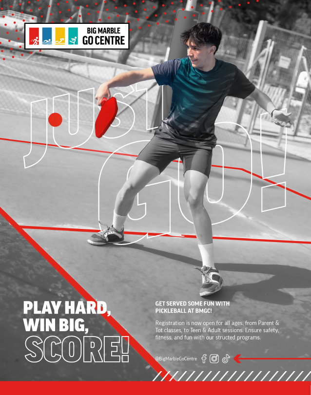
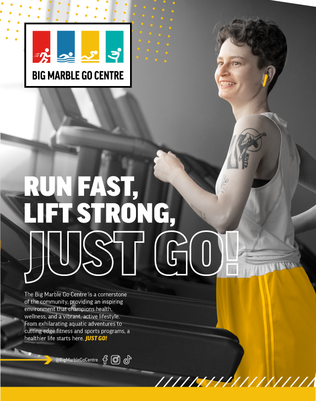
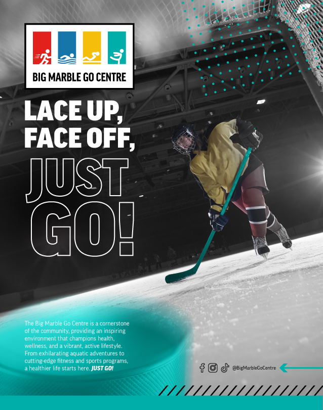
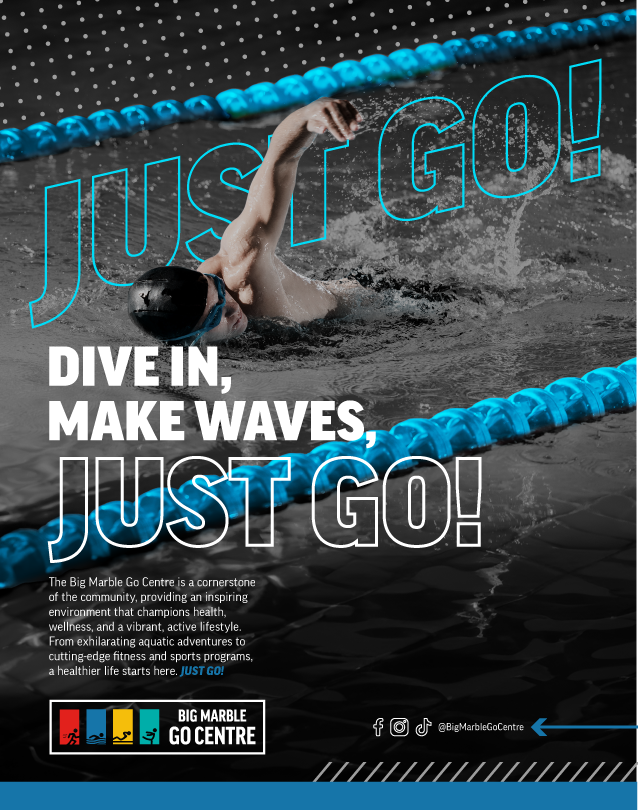
Color bars, dots, and line graphics give a fresh, modern feel to the visual identity, offering a flexible design element that works across different platforms. These features can be used to frame images, draw attention to key information, or just add a bit of visual flair—helping create a consistent and engaging brand look.
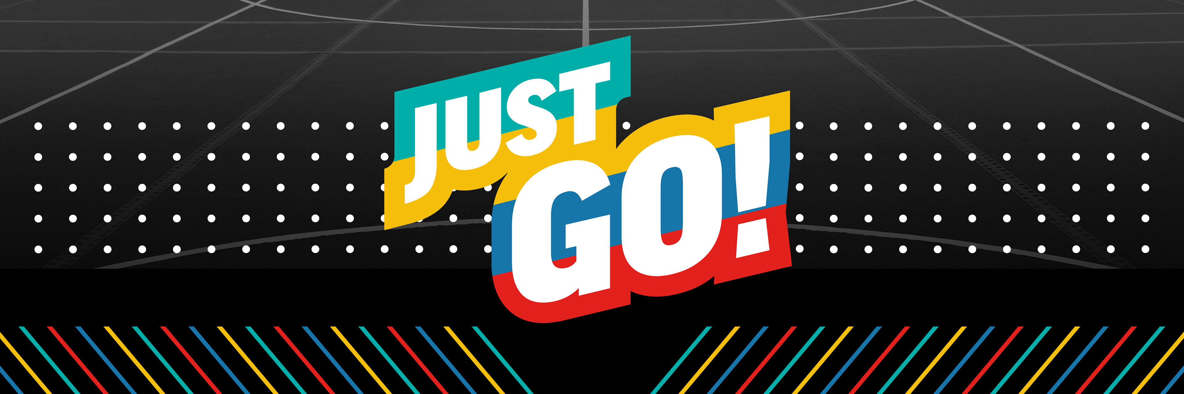
Photo Mix
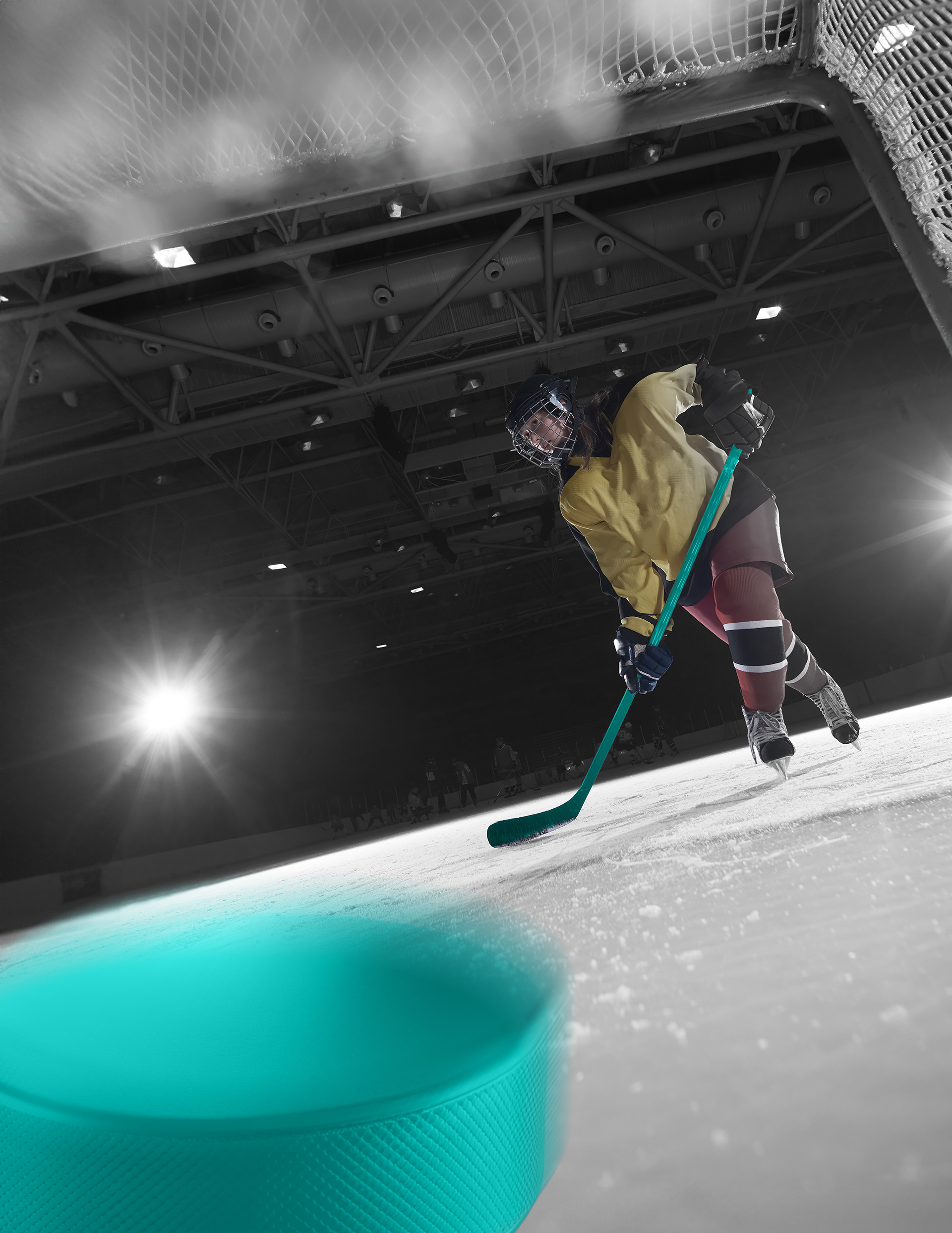
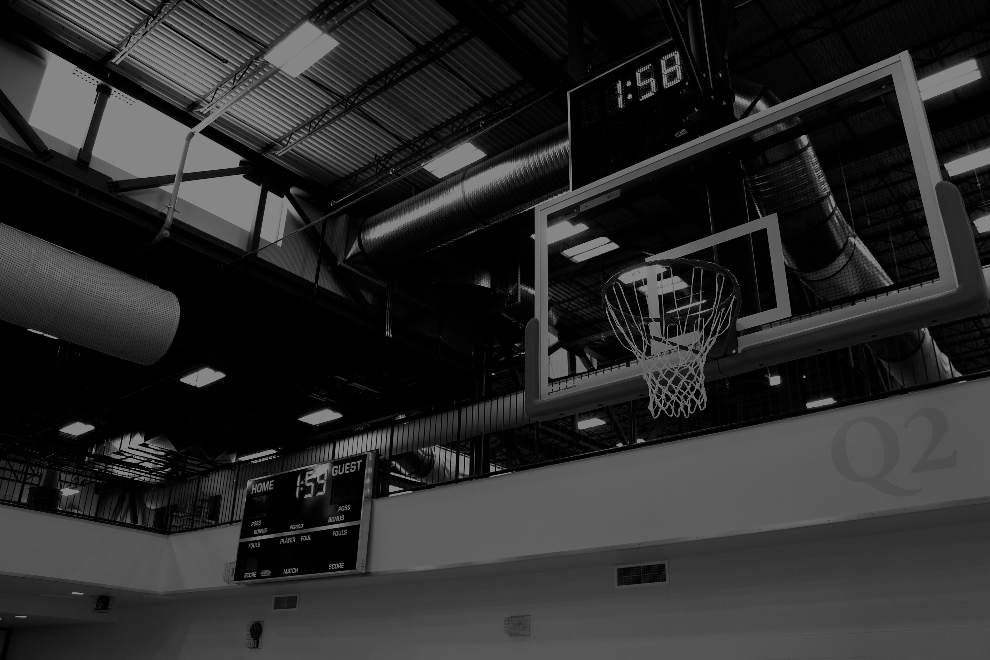
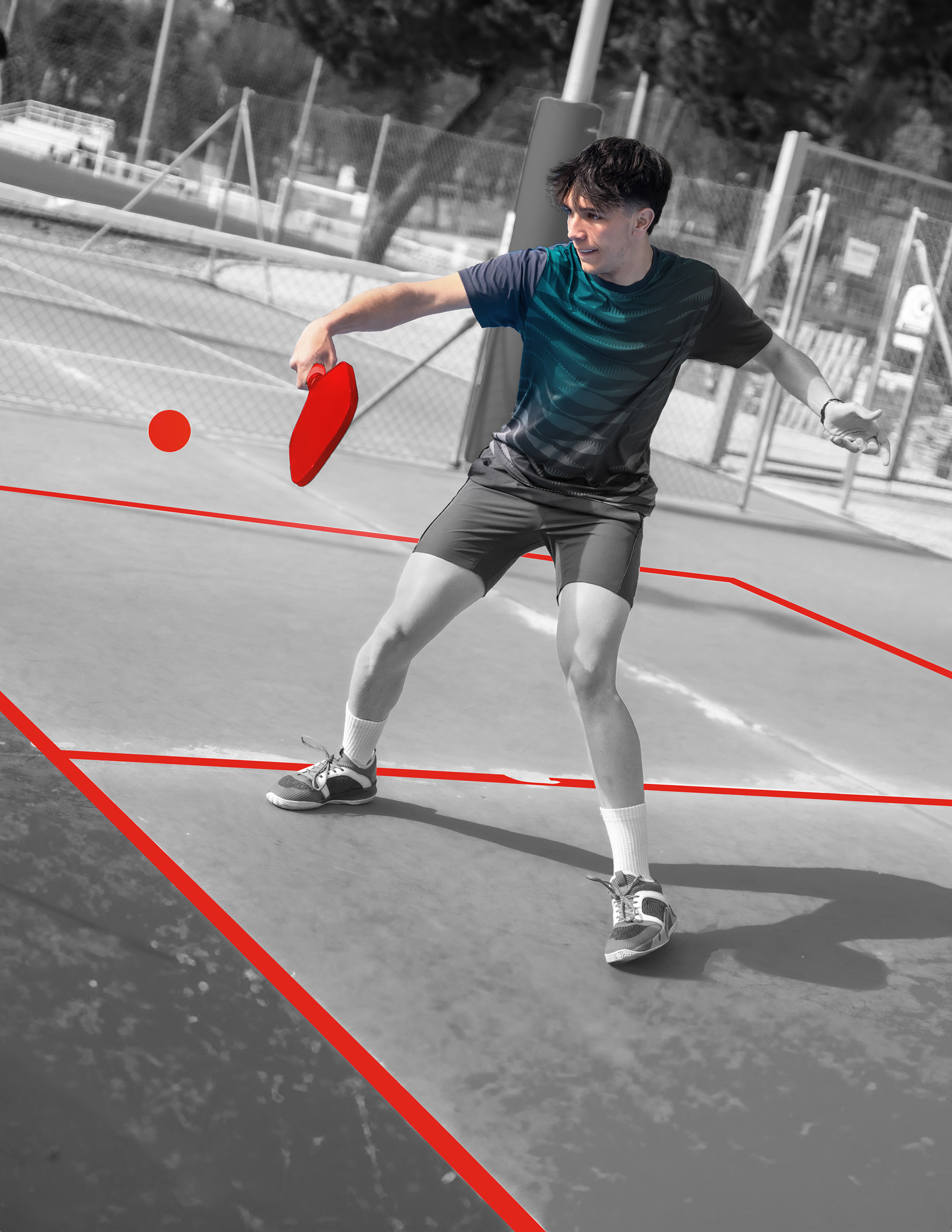
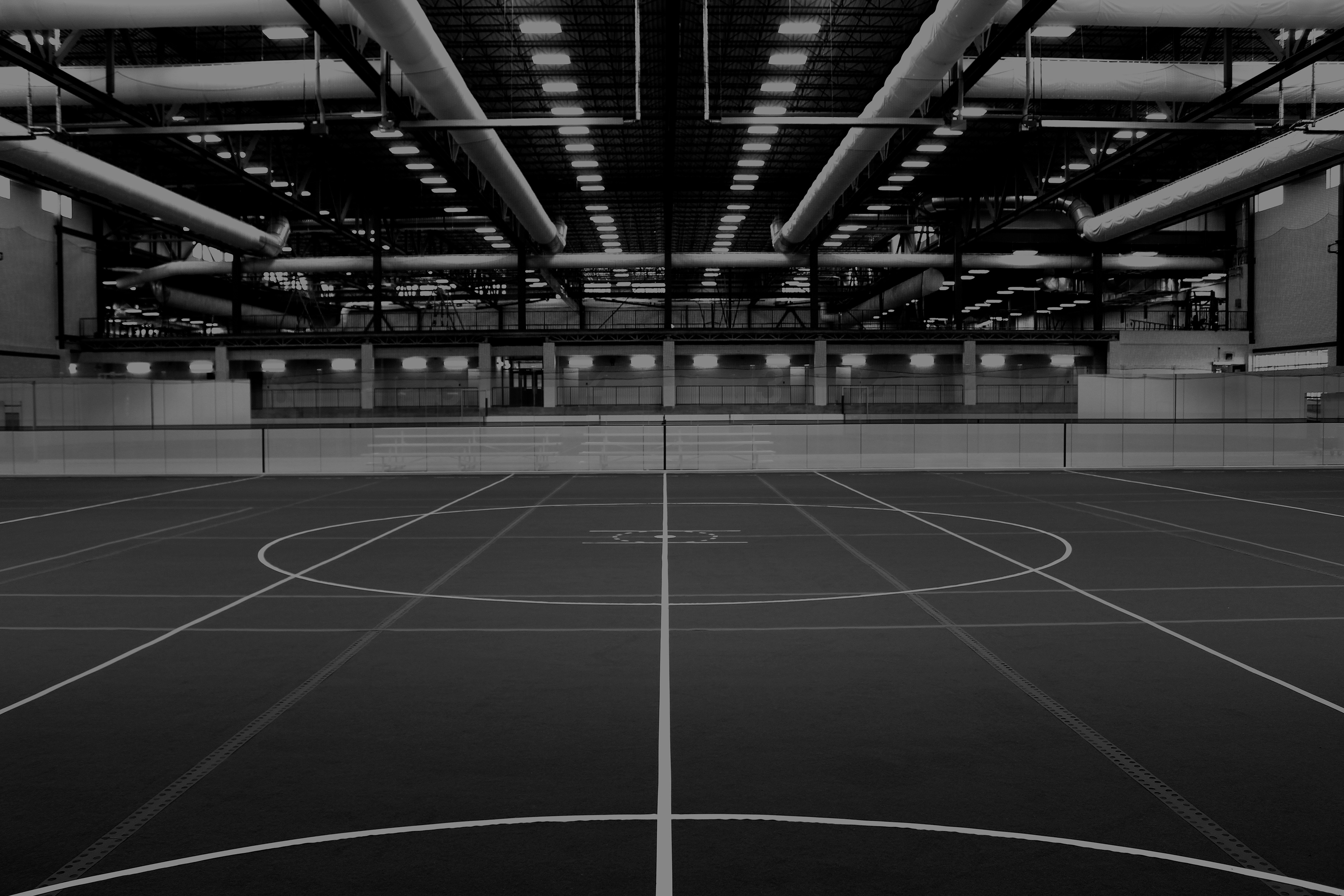
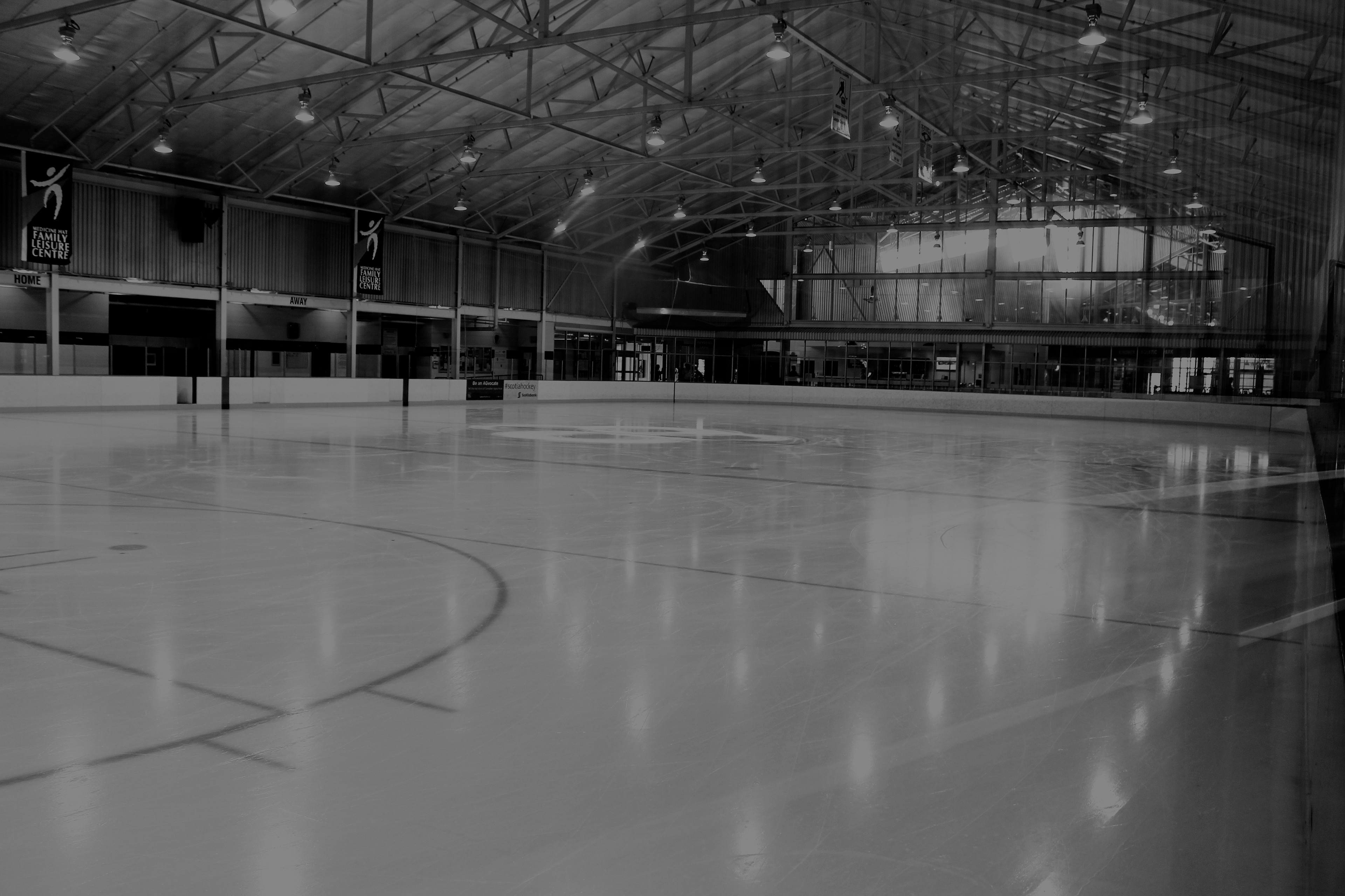
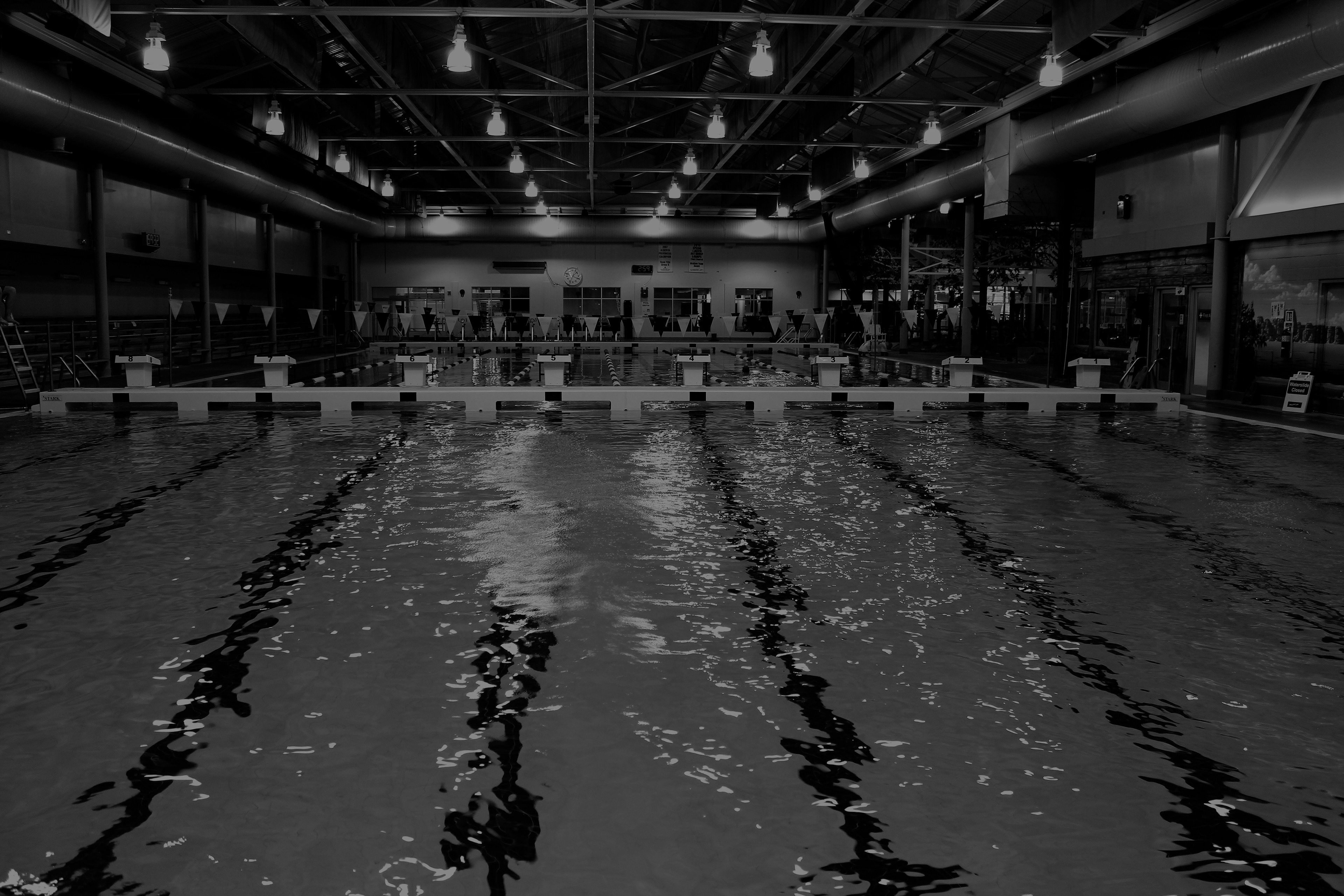
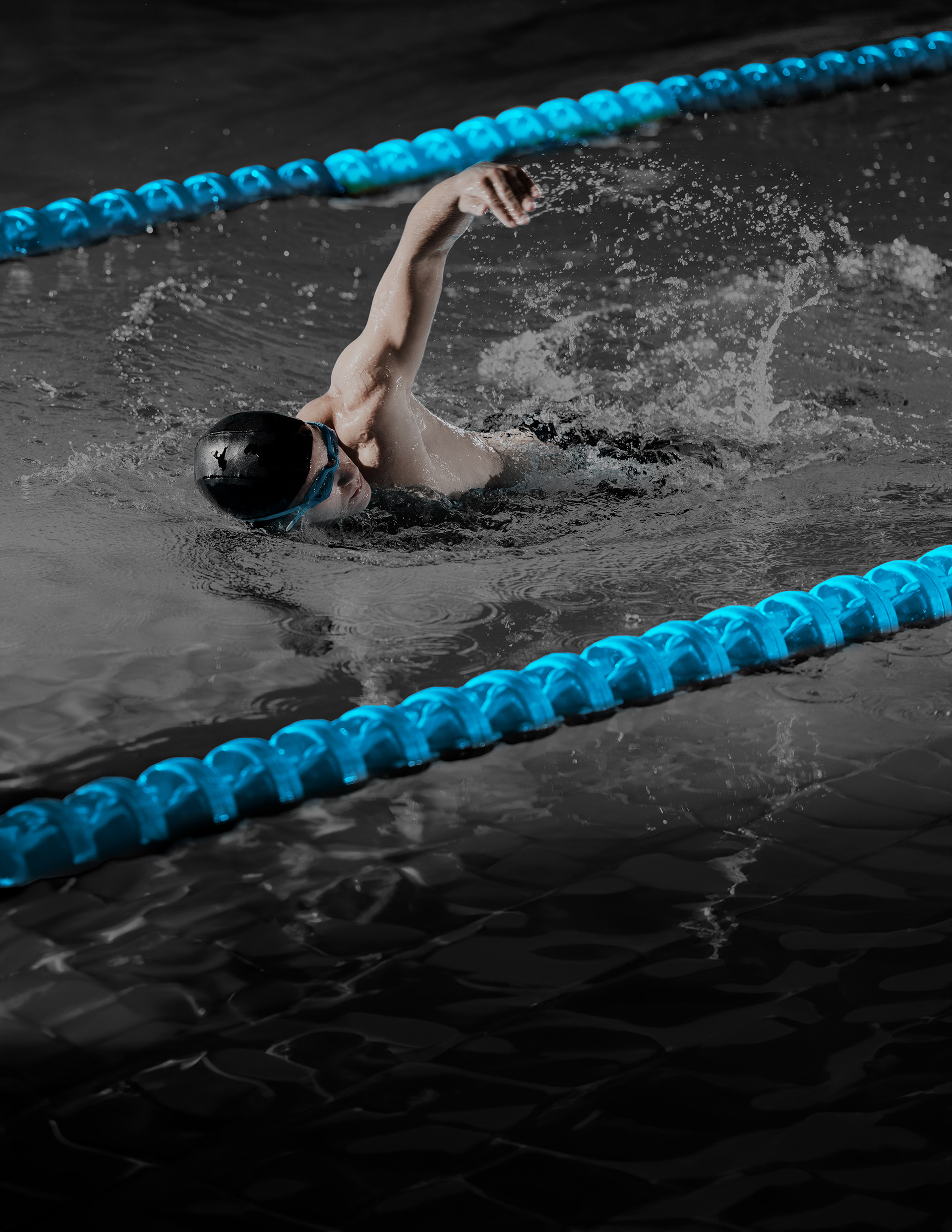
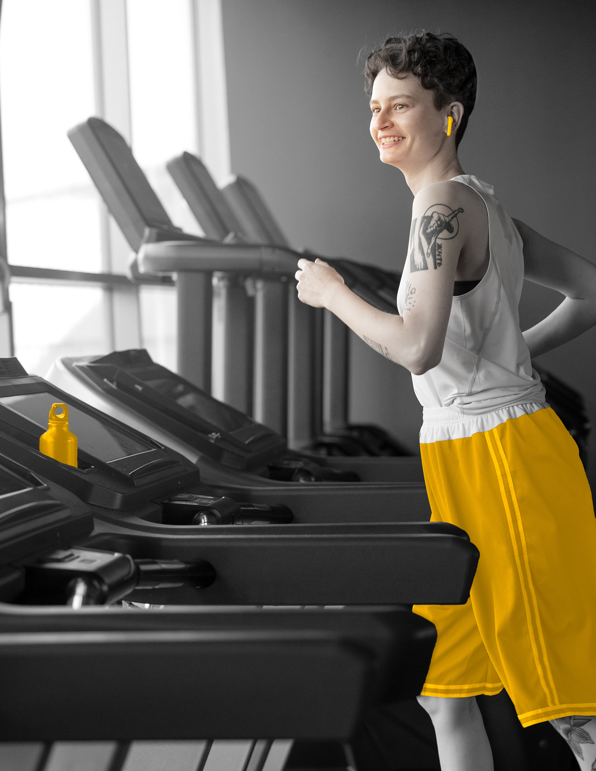
Selective colour and deep black and grey photo treatments are used to align dynamic imagery together.